Sydney Opera House
This was a rare and interesting project that came in via Interbrand Sydney who'd been slaving away on the SOH rebrand for over a year. The overall brand system had been mostly solved by the time Collider was engaged but the big question mark was how it was all going to come to life as a strong motion system. It's always appealing to bring print ideas to life but in this case I thought it deserved an approach that had its own origins true to Utzon's design thinking. Utzon, the original architect of the Sydney Opera House, had a process so rich in forms and ideas that it was a tantalising point of reference for my design process.
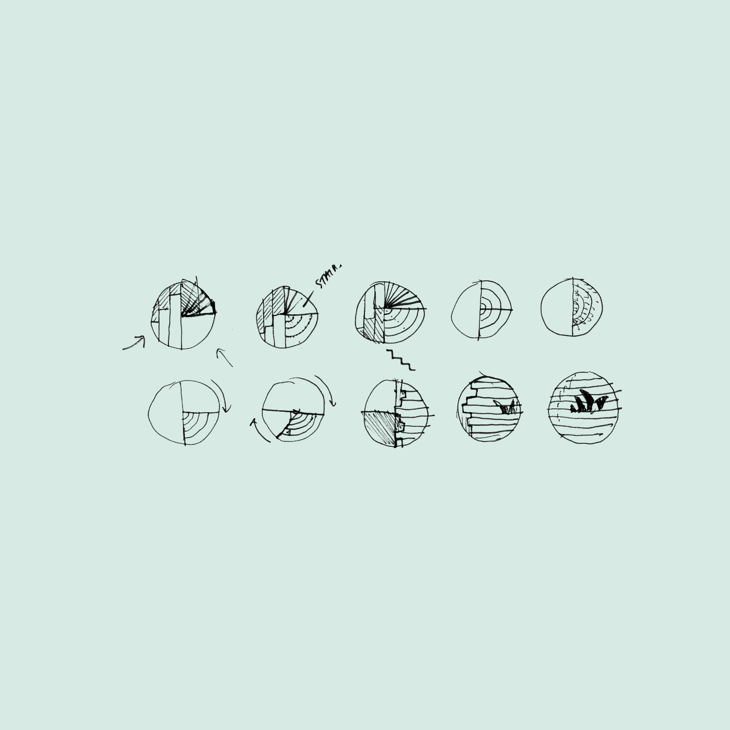
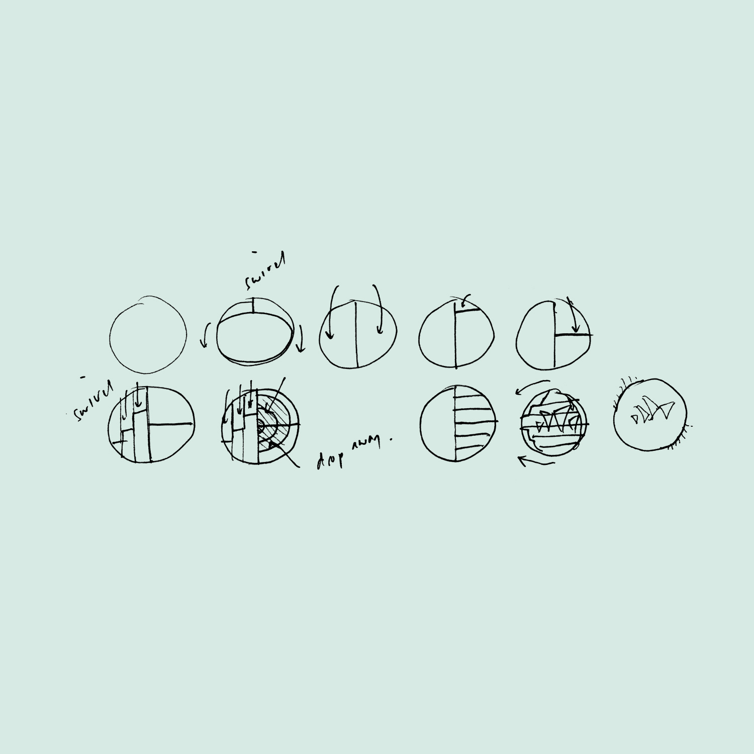
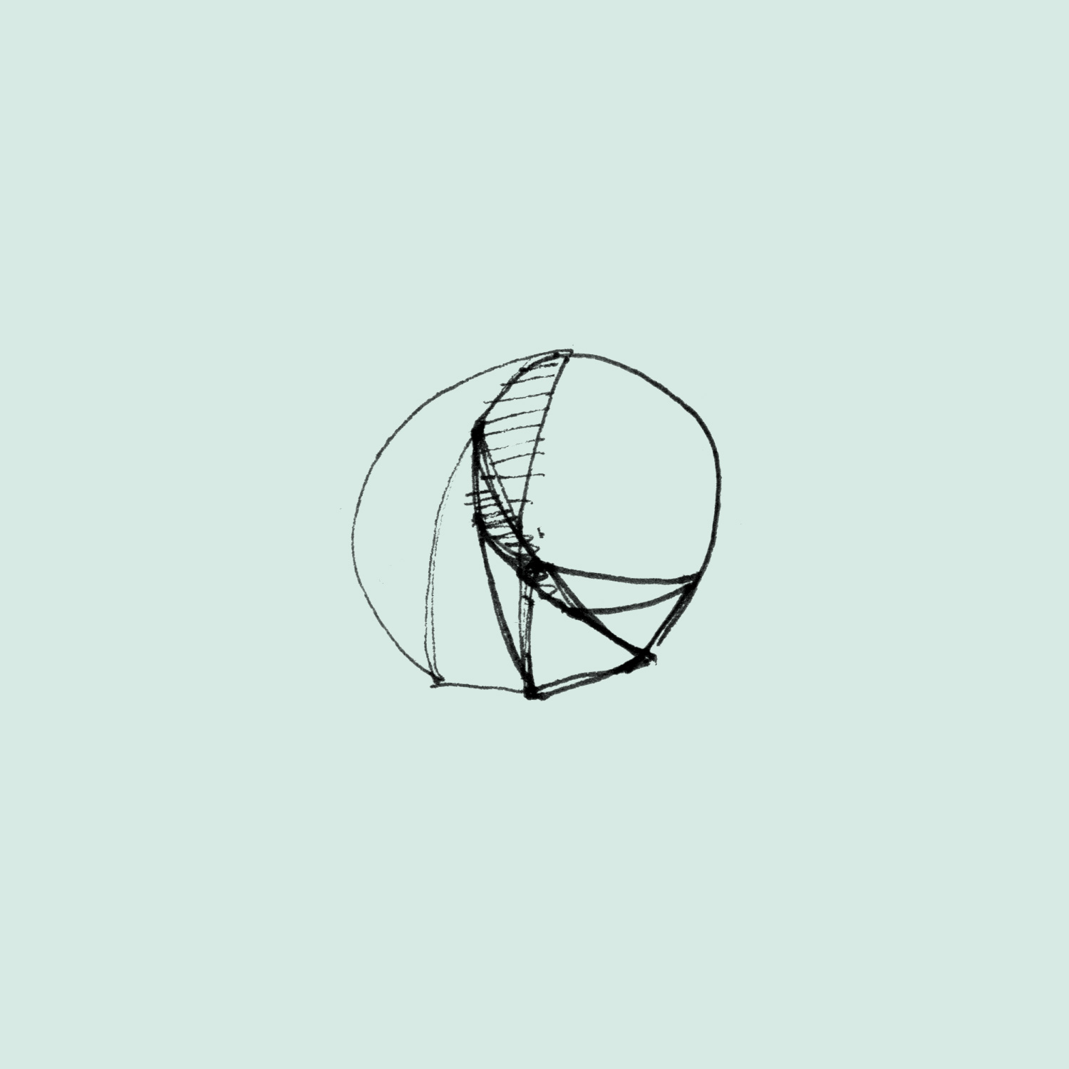
The overall approach involved exploring how simple geometric form animations could create a suite of elements designed to capture the thematic range of the SOH experience. At its core the system took influence from Utzon's spherical solution(an engineering principle for how the Opera House's sails were achieved) which formed a base that was then extended to 28 or more other form sequences.
This was a rare and interesting project that came in via Interbrand Sydney who'd been slaving away on the SOH rebrand for over a year. The overall brand system had been mostly solved by the time Collider was engaged but the big question mark was how it was all going to come to life as a strong motion system. It's always appealing to bring print ideas to life but in this case I thought it deserved an approach that had its own origins true to Utzon's design thinking. Utzon, the original architect of the Sydney Opera House, had a process so rich in forms and ideas that it was a tantalising point of reference for my design process.
The overall approach involved exploring how simple geometric form animations could create a suite of elements designed to capture the thematic range of the SOH experience. At its core the system took influence from Utzon's spherical solution(an engineering principle for how the Opera House's sails were achieved) which formed a base that was then extended to 28 or more other form sequences.