Sydney Theatre Company
I began working with STC in 2011, three years into Cate Blanchett and Andrew Upton's time as Artist Director's of the company. Over the years, with successive Artist Directors, the company's visual system had changed dramatically with the tastes of each new leadership. The strategy going forward for STC was to create a definitive and long term system that could adapt well to the presentation of their diverse nature of plays to many different audience types while always being true to their values, that of fun, irreverent and intelligent theatre. Much of the evolution proposed involved how type and colour could speak to their distinctive character. But one of the most challenging aspects was how information could be systematically paired with a vast spectrum of imagery, yet still have personality and flexibility across a diverse communication program.
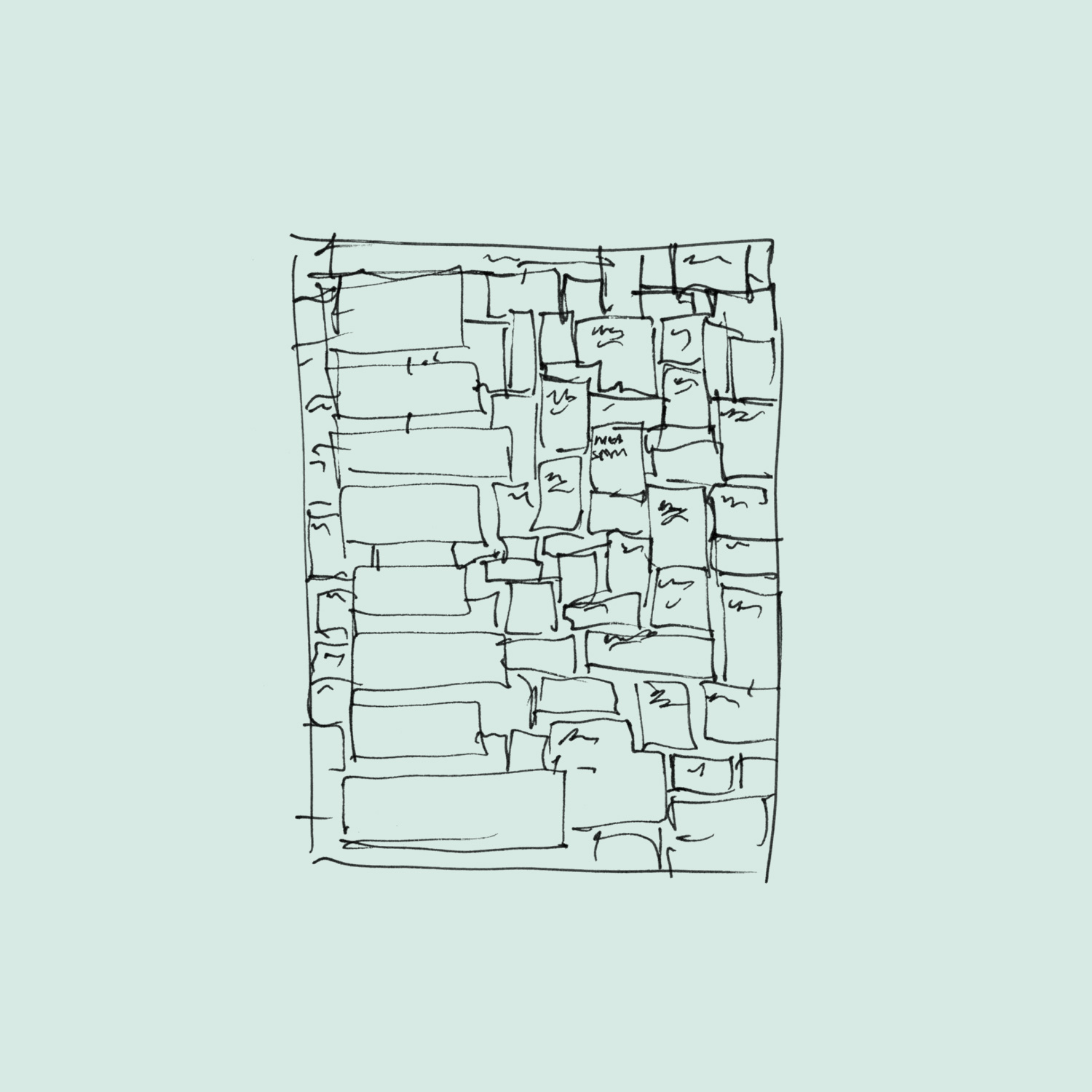
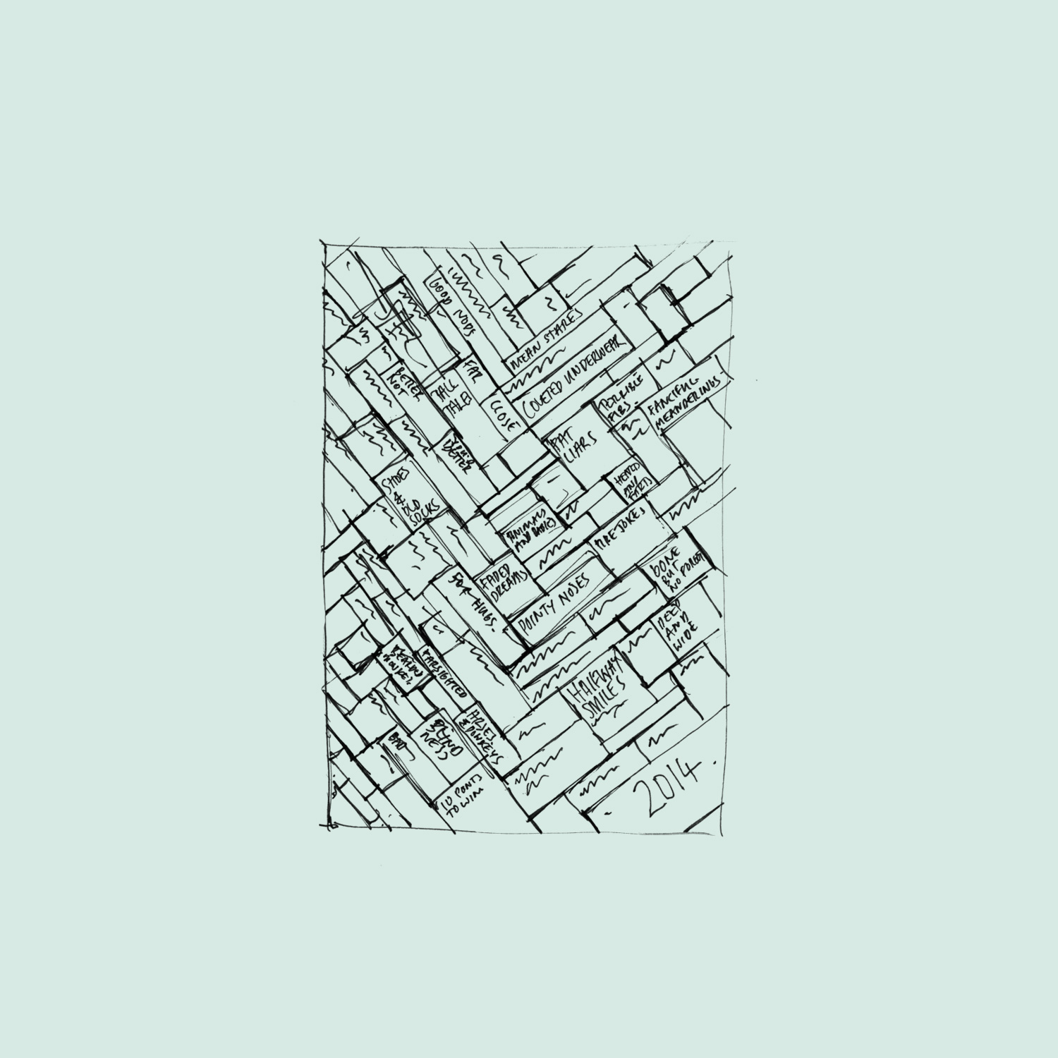
An important part of the new suite was how pattern became a signifier for the brand and a voice for each season. After introducing a colour block system in 2012, we evolved the simple geometry to bands of colour, and later a continuing pattern theme. The patterns became strong statements for STC and made their way across both our campaign elements and the broader theatre voice through the year via the in-house design team. These are most of the sketches that led on to the pattern form of each campaign.
I began working with STC in 2011, three years into Cate Blanchett and Andrew Upton's time as Artist Director's of the company. Over the years, with successive Artist Directors, the company's visual system had changed dramatically with the tastes of each new leadership. The strategy going forward for STC was to create a definitive and long term system that could adapt well to the presentation of their diverse nature of plays to many different audience types while always being true to their values, that of fun, irreverent and intelligent theatre. Much of the evolution proposed involved how type and colour could speak to their distinctive character. But one of the most challenging aspects was how information could be systematically paired with a vast spectrum of imagery, yet still have personality and flexibility across a diverse communication program.
An important part of the new suite was how pattern became a signifier for the brand and a voice for each season. After introducing a colour block system in 2012, we evolved the simple geometry to bands of colour, and later a continuing pattern theme. The patterns became strong statements for STC and made their way across both our campaign elements and the broader theatre voice through the year via the in-house design team. These are most of the sketches that led on to the pattern form of each campaign.